Please remember that WiKirby contains spoilers, which you read at your own risk! See our general disclaimer for details.
WiKirby:Featured Picture Nomination/Failed Archive
From WiKirby, your independent source of Kirby knowledge.
Jump to navigationJump to search
Failed Featured Picture Nominations
The following nominations for Featured Pictures have been unsuccessful.
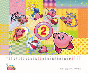
Club Nintendo Calendar (21 February 2010 - 13 July 2010)
Don't worry, it'll never appear in it's full resolution dotted form. If anyone can clean that, I'd be grateful. But the image is unique enough and current to warrant a rotation on the Main Page. Axiomist 01:33, 21 February 2010 (UTC)
Support
- This is very colorful, has lots of action, and should be a featured picture. -Sixeightyseventyone (Talk)
- Very neat, fitting into style, and its oringnal! -KirJoey (Talk)
Oppose
- It looks like the creator copy and pasted official artwork onto a quilt. :/ There's probably a better one somewhere on this wiki. Gamefreak75 (Talk)
Neutral
- I don't know if they're will be better images to vote for and honestly, I'm not a huge fan of the image. -YoshiFan2215
- I like the image, but the big "February 2" isn't something that I would personally like to see as a part of a featured picture. -Globin723
- The eight weeks have most certainly passed, which also means one part of Axiomist's comment when nominating is now invalid (it's no longer current). It's a nice image, but I don't know if it's one I'd like to see on the Main Page. Moydow 23:07, 12 July 2010 (UTC)
Tree in Whispy Woods (June 1 2010 - 5 September 2010)
It follows all the requirements of the Featured Picture and is a neat pic. --68071 (talk) 22:48, 1 June 2010 (UTC)
Support
Oppose
- The image looks very bland, especially compared to later artwork. Very few (and dark) colours, no shading at all and generally lacking in detail (the fruit are just circles) and eye-catching features.--Vellidragon 15:36, 16 June 2010 (UTC)
- The image is colorless and doesn't catch the feel of Whispy Woods. -- կրակ (խոսել) -- 23:59, 16 June 2010 (UTC)
- I agree. Its coloring is really dark. Turtwig A (talk | contribs) 00:22, 17 June 2010 (UTC)
- It WAY too dull, with just 4 colors, dull brown, dull green, dull red and black. I also agree to the other 3's coments. 0%shading, 1.02%detail, 0% eye-catching features and 100% blandness.Meta Knite (talk)--5:31, 12 July 2010 (UTC)
- I agree with everything said above. It's just not as colourful, as vibrant, or as detailed as many of the other images out there. We need something brighter on the Main Page. Moydow 21:53, 12 July 2010 (UTC)
- Per all. With 2 words I can describe this: TOO DULL. But it has good coloring, though. --Joey
Neutral
Shouldn't this nomination be over? Turtwig A (talk | contribs) 13:06, 19 August 2010 (CDT)
